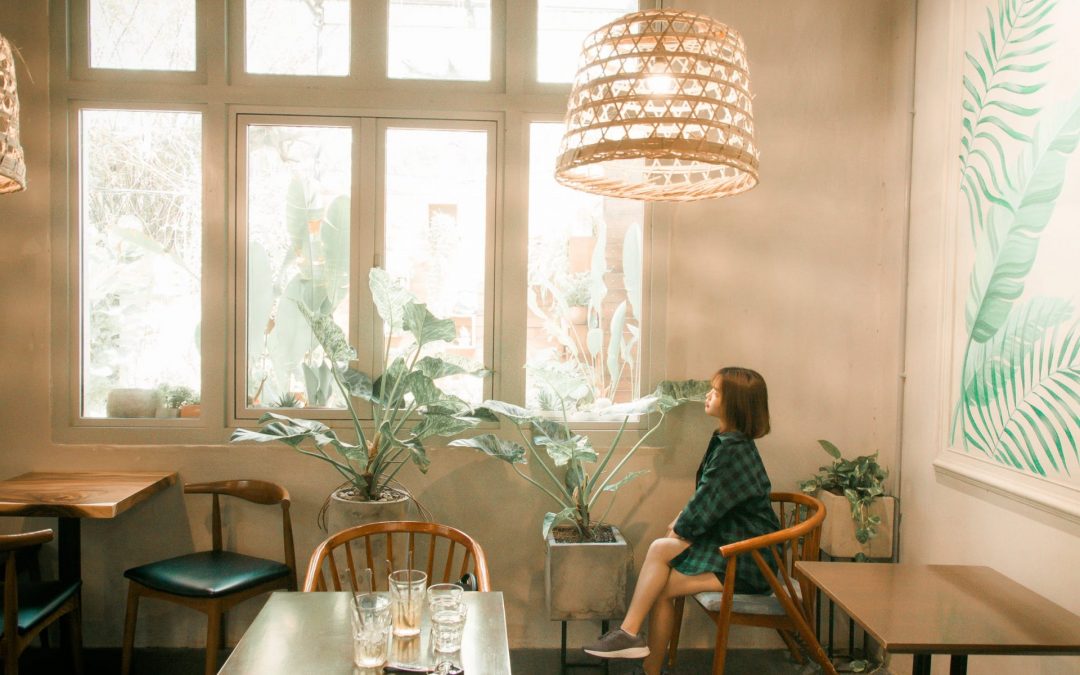
What seems like the perfect colour for your restaurant now might not be the same a few years later. Your style and interiors might change, and the paint must adhere to them to complement the look of your restaurant. Moreover, choosing a colour involves taking into account light levels, the restaurant size, cuisines, and service styles, among other things.
Here are some of our suggested hues for aesthetically pleasing restaurant interiors:
1. Blue as the Colour of the Seas
Blue is a conservative colour and represents safety and stability. It’s one of the many reasons why corporate logos use blue. It’s arguably the most popular colour globally and can evoke a range of emotions, depending on the shade you’re using.
For instance, a lovely clear blue evokes the sea and its bright, calming colours, making it the best option for seafood restaurants. If you don’t want to paint your walls blue, you can use it as an accent colour in the wall tile and on your menus instead.
Blue also goes well with bars and coffee shops, according to the theory that blue makes people thirsty. But when it comes to restaurants, blue is best used as an accent instead of the primary colour due to the belief that blue is an appetite suppressant.
While the exact reason is unclear, people believe it has something to do with food tending to turn blue when it spoils or that there are rarely blue foods in nature.
2. Green as the Colour of Nature
Green is found everywhere in nature. It promotes peace, relaxation, and harmony, and is believed to reduce stress and encourage tranquillity. Earthy, muted greens give off a sense of freshness, making it an excellent choice for juice bars or restaurants that focus on light, healthy food.
Bright green also works well with restaurants, but a hint of lime green goes a long way. It’s better to use bright green as an accent colour, such as fresh greenery on the tiles behind the bar.
Moreover, green’s connection with freshness is not the best choice for restaurants focused on meat, such as a steakhouse. Green walls can also reflect on your food, which doesn’t offer the best dining experience.
3. Black as a Classic Colour
Black is the colour of strength, sophistication, and power. It gives off a chic and timeless feel that is great for every restaurant. It can be an incredible accent colour and will look smart when placed against white tiles or textiles.
Black is also excellent for menus since black text against a white background is easy to read. However, it’s important to note that an all-black room is not inviting to customers. You can pull off an all-black room with different textures, but it’s not for the faint of heart.
Conclusion
Choosing the best colour for your restaurant depends on what you have to offer and the feel you want to create for the interiors. Remember always to get a sample and paint a big square on the wall, so you can assess how it looks at different times of the day before deciding on it.
BC 3D Painting is a local painting contractor for residential and commercial painting in Vancouver and the Lower Mainland. We provide interior, exterior, commercial, and strata painting, as well as wood staining with a team of dedicated and expert house painters. We take our job very seriously and are committed to delivering the best interior and exterior painting services. If you need a painting service in Surrey, get in touch with us! We look forward to working with you.

